Webcomics are a very hard art form to master, I would say. Not only do you need talent in drawing but you'd also need the talent in comedy or story telling. A lot of webcomics sadly struggle to balance the two but usually, a funny / well told webcomic can outshine if it has bad or simplistic art, such as Cyanide and Happiness or The Adventures of Business Cat to an extent. You don't need to be a Picasso to make a good web comic but you kinda need to be a George Carlin to make a good web comic.

Taken from the Adam Ellis Facebook Page
Adam Ellis (AdamTots) is a gentleman that works for the controversial Buzzfeed. [Full disclosure; The company associated with Adam does not influence my opinion towards himself or his work in any way as I believe his webcomics are a seperate entity or Buzzfeed at least just has their name there by association only]. His Facebook page is almost at 800k likes, his Instagram being at the same magnitude and he even managed to publish a book in 2013. Not too shabby. He must have a shocking talent when it comes to drawing and / or comedy, right? If you know SoFloAntonio or The Fat Jew, you know that you don't have to be talented or funny to get a tonne of followers on social media or a book publishing deal but let's save that for now. This review will be broken down into the two categories of art and comedy and then combine to create a conclusion at the end. Let's get started.
THE ART
It might be strange to say I really don't mind the art style. It's not amazing or anything but Adam can at least say he has his own style. The Cinderella comic pictured above isn't awfully drawn and is one of the better examples of his art and slightly going out of his comfort zone. The biggest problem I have with his art is how lazy it is.
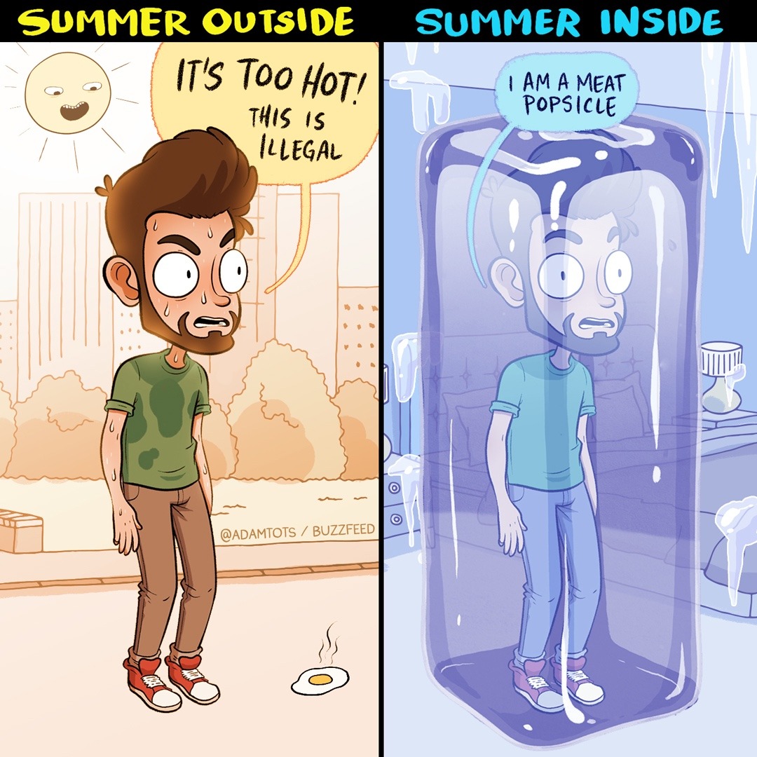
This is Illegal
Notice how in this comic, despite being in two different temperatures, the character's body is reacting in the same way... and not just similarly, I mean exactly the same way. The only things that are different are the positioning of the eyes and the sweat marks disappearing in the second panel. The dude is pretty laid back despite being in two extremes of a situation. The only visual cues we get is the sweat marks in the first panel and the blue hue in the second. Body language is a funny joke in of itself. Him standing there, not giving a crap isn't some kind of anti humour like Tim and Eric, it's lazy artwork. The second panel is very reminiscent of the Scooby Doo episode where the gang find a caveman frozen in a block of ice who also seems pretty chill (heh) considering he was frozen for millions of years. The excuse there, however, is that Scooby Doo was released in the late 60s where the technology was primitive and animation was on a shoestring budget while here, it's a dude with a Wacom tablet in the 2010s who can't be arsed to do anything but copy and paste one drawing.
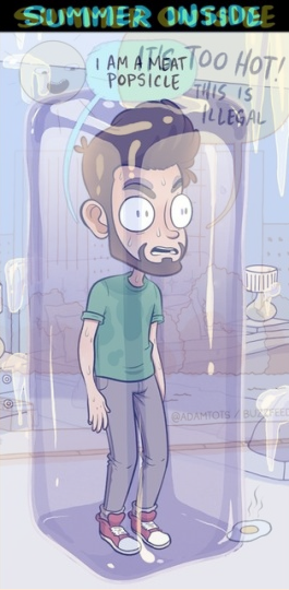
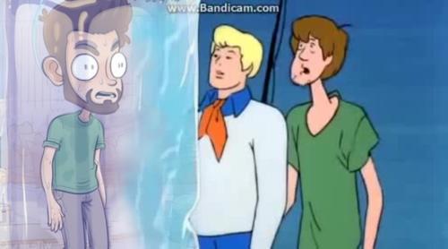
Am I glad that he's frozen in there and we're out here and that he's the sheriff...
Credit to trained-chimpanzee on tumblr for the visual reference
Credit to guitarbeard on tumblr for the Scooby Doo edit
 Do I Win?

 Who Wore It Better?
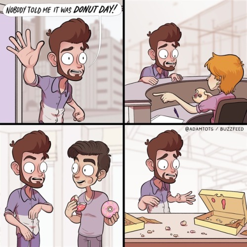
That Feeling When You Miss Donut Day At Work

Credit to trained-chimpanzee on tumblr for the visual reference
Credit to guitarbeard on tumblr for the Scooby Doo edit

Here's another example. Notice how the exact same face for the character is used four times, the second being the only one with a difference (yes, even the Sim on the screen in the fourth panel has the exact same face as panel 1 and 3), that difference being his eyes changed direction. Even the last panel is lazy. Cup Noodles are an actual brand name and it looks as if the label was either traced or photoshopped on. Also, the perspective for the character looking at the Mac screen is off.
Notice how the body is not alligned with the screen. The character seems to be stressing his body to see it at a weird angle and is positioned in a way where he'd only clearly see one side of the screen. The desk also looks slanted, looking as if the character will roll away any second... except he won't because the chair is a completely different perspective to the desk despite them being on the same level. I could be nit picking but this seems like it's been done in a way to avoid the character being rotated slightly or the desk matching the perspective of the character to streamline the drawing even more than it already has been.
 Who Wore It Better?
THE COMEDY
Comedy is more difficult to talk about. While artwork is somewhat unanimous, humour is subjective. As much as I despise The Big Bang Theory with every ounce of my pathetic, overweight, slowly withering, manlet being, it's popular enough to run as long as it is because there are enough people that like it. I liked the short running We Are Klang series that ran on BBC3 despite the majority hating it. What matters is how you explain yourself.
Adam opts mainly for the "so relatable" humour I've come to dislike over the years. Relatable humour I dislike because it's the easiest form of humour yet it appeals to so many people because it tickles something in their brain that says "Yeah! That's happened to me!", tricking themselves into thinking what they're seeing is comedy genius when, in fact, it's just pointing out a thing, like the Sims and weather comic from earlier. We get hot. We get cold. That's apparently a joke. It's very similar to reference humour where someone shouts a meme or does something line for line from another piece of media and them doing that is treated as a joke rather than reminding you a thing exists. Relatable humour can work, such as being over exaggerated or actually making a clever observation rather than just pointing it out. A good example of this off the top of my head is the Adventure Call sketches from Limmy's show, the premise being a choose your adventure game played on TV down a phone. The comedy doesn't come from the fact that it's like those quiz shows you watch at 3 in the morning because your neighbours are having loud sex and you can't sleep and you turn the TV on yet there's fuck all on because it's 3am and nobody can answer the questions because they're so hung over or tired and the same person has rang in 6 times, raising their phone bill up the arse and said Spiderman was a DC villain every time but the comedy comes from Falconhoof, the show host, sticking to a script and becoming hard to deal with due to that and the reactions of the callers that play Adventure Call. We can relate to this because we know these types of shows and know they're a waste of time but the conflict between the hard to negotiate with Falconhoof and the caller is where the comedy comes from.
Limmy's Show - Adventure Call - Kill Jester
Adam doesn't take a familiar thing and do something different with it. He mostly goes the "point it out" route.
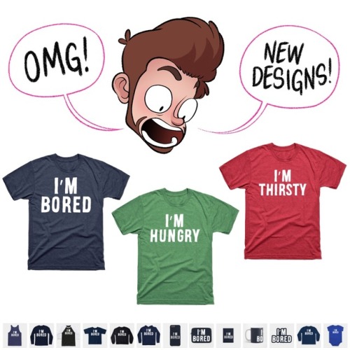
"I'd rather sleep than be social / go out" is one of the oldest "relatable" "jokes" in the book. Sleep is something we all do and there are definitely those days where we can't be arsed to do anything but it's not a joke. Pointing out any human emotion isn't a joke. It's just an observation. If stating how we felt was a joke with no exaggeration or a clever / interesting observation or deconstruction to it, Facebook would be a comedy gold mine. I should be hired for The Fringe Festival right now for saying I was bored on my Facebook 8 years ago. It's not like you can sell shirts of the most common phrases or anything. OH WAIT!
Adam also does reference humour. The best one to analyse has already been done by some folks on tumblr.

That Feeling When You Miss Donut Day At Work
For those 5 people that are unaware, this is a reference to an awful webcomic called Ctrl+Alt+Del. In a nutshell, it's a "so relatable" webcomic but about video games. A whole other blog post could be dedicated to that entirely but in a nutshell, Tim Buckley, the artist, has been criticised also for lazy art and easy humour. To make things more interesting, he tried to create a story involving his self insert and another character being in a relationship and out of nowhere, in this silly comic about vidya gamz, did a comic about a miscarriage;
The joke of making fun of loss doesn't come from the dark subject matter but instead comes from the silly vidya gam comic Ctrl+Alt+Del wanting itself to be taken seriously despite the previous comic attempting to make fun of video game retail stores. I cannot do justice why Adam's version is so bad but, as stated earlier, here is the discussion from some folks on tumblr that word it perfectly.
Credit to spacecadetstef, skybreakerpony, suloth, moontouchedmoogle, nolanthebiggestnerd, scotchtapeofficial and jerryterry on tumblr
Yes, somehow Tim Buckley is a better storyteller than our friend Adam here. Let that sink in.
There was also the time I think he tried to do self aware humour;
Either Adam is blissfully ignorant of the criticisms of how lazy his art is or this was actually a reference to those criticisms. If he did this comic and took those criticisms on board and actually improved his art, there would be no problem with this comic... sadly, every comic I've shown previously have come out in 2017, the most recent being July, the date of writing this while this comic was released in November of 2016. Ironically, recolouring is less lazy than moving a couple of small features of a character slightly. Notice it again in this comic. Panels 2 and 4 are almost exactly the same. The only difference is his right eyebrow is lifted. His recolour upstages his laziness in the same comic. How do you do that? That's why this joke fails if it was meant to be self parody.
IN CONCLUSION
I think the most upsetting thing is that Adam might have potential. As I said earlier, his art style doesn't offend me and he can say it's his own and there is a spec of funny in a couple of his comics such as the Cinderella comic from earlier, fuk u gleebtor and this Mario one. They're not downright hilarious but you can see there was an attempt at a joke but this is so far and few between. A good chunk of his content is similar to the stuff I've shown in this review. I honestly feel it's apathy bringing Adam's work down. He doesn't have to try. He can just try to relate to the youth and get 10k likes per post which means more views which means more money and as hinted earlier, the guy is literally selling shirts for $15 - $20 a piece that say "I'm Hungry" and "No." on them... and they presumably sell well;

If making money doesn't require any effort, why bother, huh?


